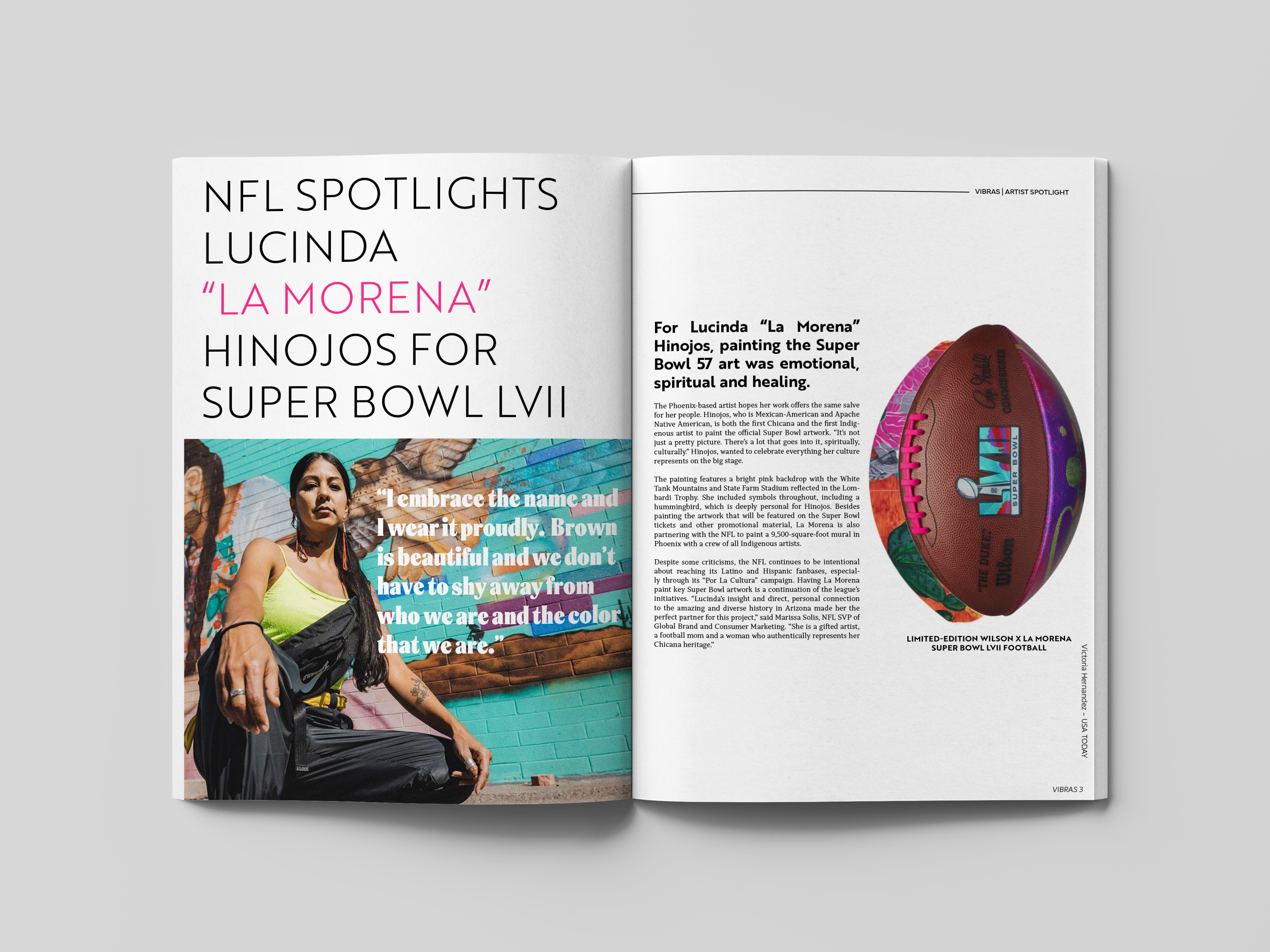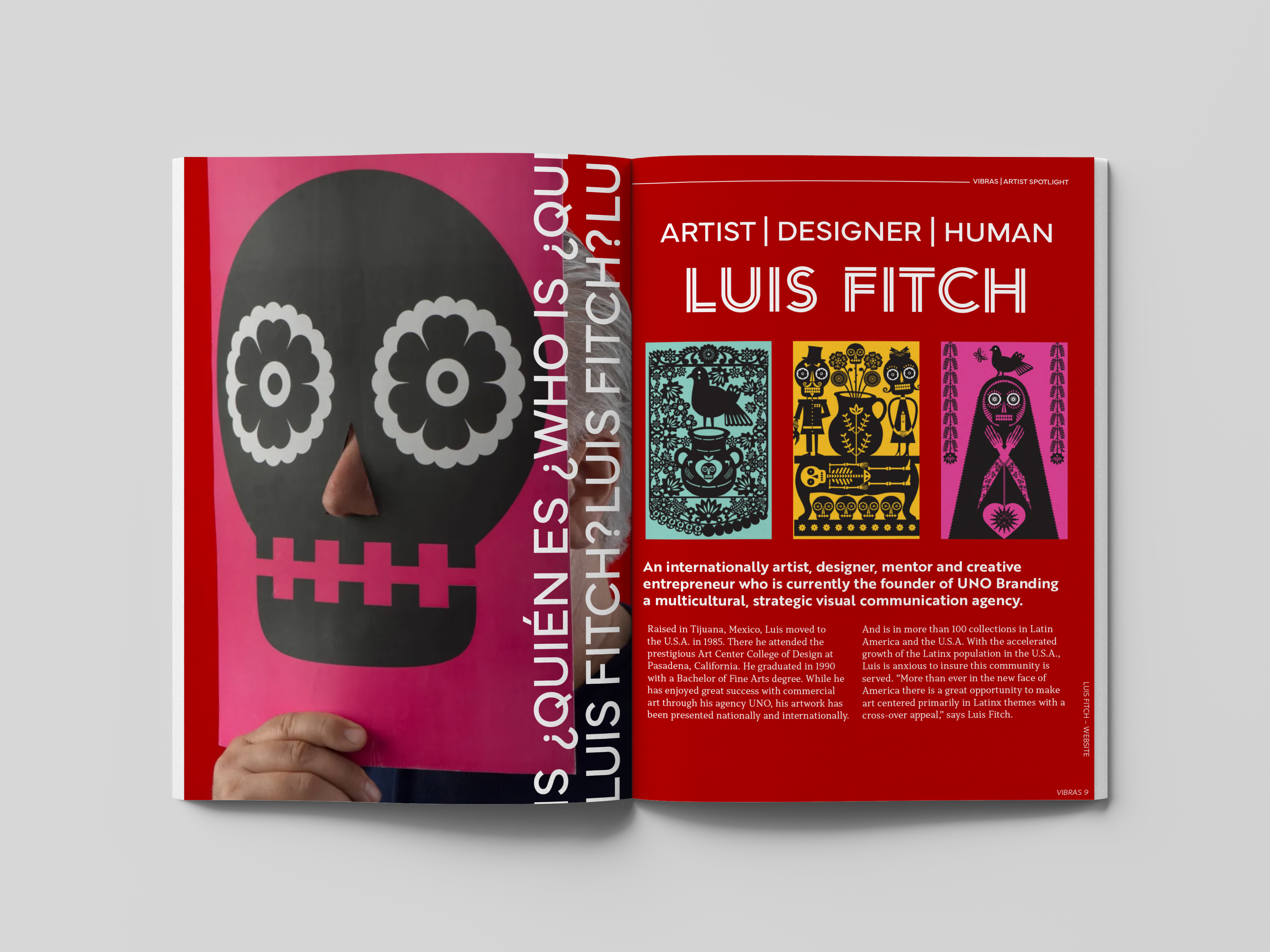
VIBRAS is a design system project that follows publishing rules, intersects design elements, captures the attention of a specific target audience, and presents a unique brand identity. My inspiration to create VIBRAS stemmed from my desire to design a magazine that captured the works of other Latino designers. Much of the branding focuses on design elements that center on Latin American cultures and peoples.
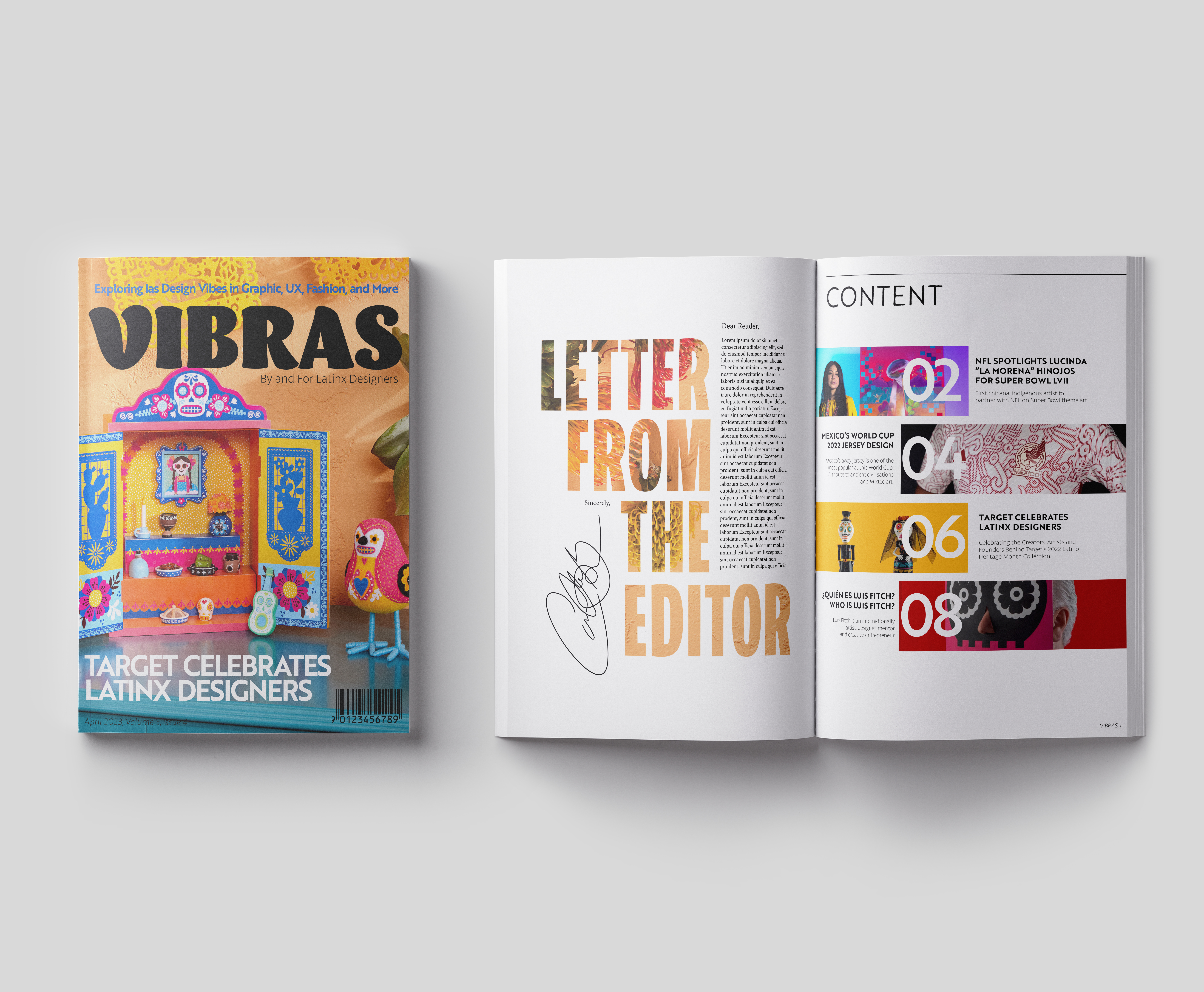
I specifically picked type that came from Foundries that aligned with Latin origins and designers. The Barricada Pro type is used exclusively for the masthead’s wordmark. The wordmark’s description uses Petala Pro, which is not exclusive to the masthead and can be seen through out the magazine as titles, running heads, folios, and etc. Brother 1816 Bold can be found in the magazine’s article titles on the cover.

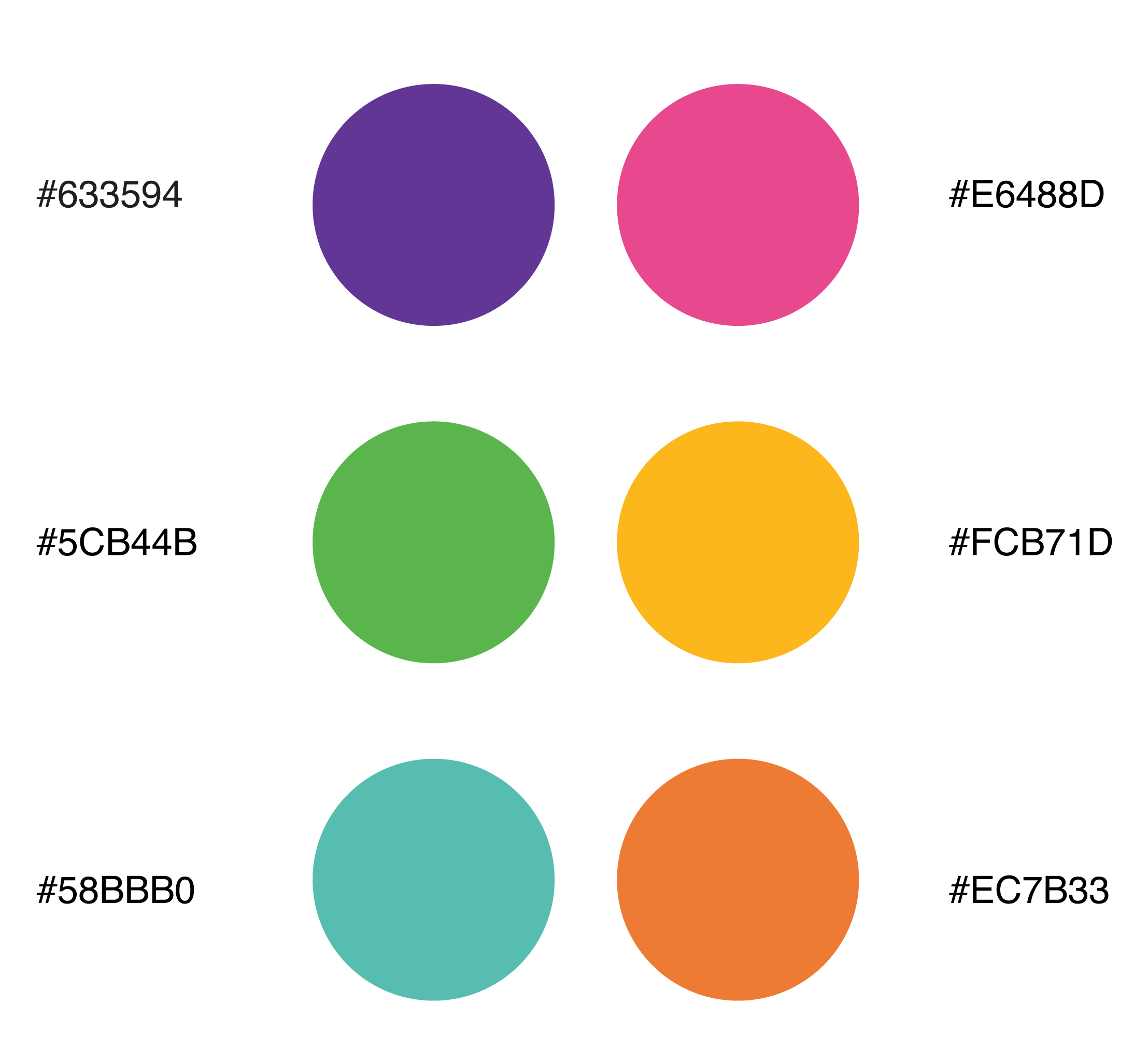
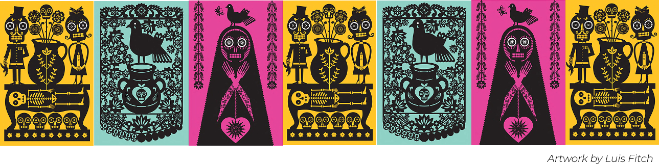
The color palette is inspired by tints found across Latin America. Many of these tints can also be found in Latinx art and architecture. VIBRAS wants to capture this cultural component and utilize it as a tool to elevate Latinx designers, and also reference their cultural heritage. You can see the colors used in context with the images shown in the style guide.